I put the response to the discord here
It is easier to add images for me
This is just comments from someone used to using the website to find product information
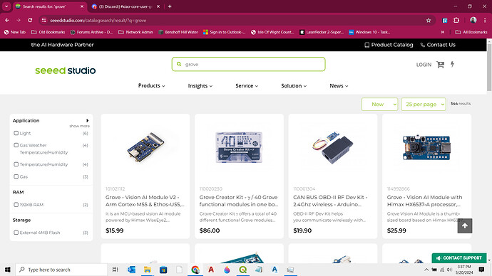
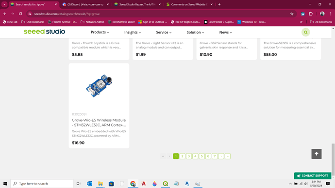
for example the list is limiting to 25 items per page, but on desktop it appears that that is all the grove products, because the last line is not full… it is not obvious that more products are available I dont know how exactly to solve this problem
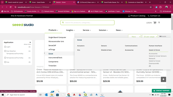
I should probably access by this route, to just get a list of sensors and not everything with grove in it
On the left side, we used to have check boxes to select, like for example, options like discontinued, available and backorder, also it was nice to be able to search by what warehouse the products were available
I know it may be a good idea to remove discontinued, but sometimes you have already baught the sensor and are looking for photo or documentation code or whatnot and want to see the page as it was when you baught
I think it is good to show other components that may work with it, but should concentrate or the core items before “accessories”
I just may be a grumpy old man, old dog that cant learn new tricks,… but hey… atleast one is a good customer… I would go back and look at how the old system worked.
also another bug is
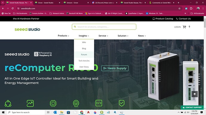
on the main page, when i load on desktop using google chrome, i try to click on insights → forum
it takes a long time for the menu to drop down… it is like it is trying to load something in the background… its not a big deal, but kinda aggrivating because i go to the forum several times a day…
Just my opinions…


